Real estate is one of the highest-grossing industries in the world, and it is expected that its net worth is going to reach a whopping $4.263,7 billion by 2025. The competition between real estate companies in both local and global markets if fierce. That is why most of the companies in the industry invest extensively in the presentation of the services they offer.
A real estate website should be easy to navigate and it must make all the information easily accessible to the website’s visitors. Despite the fact that there are hundreds of real estate website builders that offer easily customizable WordPress plugins, creating an eye-catching real estate website is not an easy task.
The Elements of Real Estate Website Design
An average visitor of a real estate website is trying to acquire as much information as possible about a property they are interested in. Building responsive and mobile-friendly real estate websites have never been more important as the number of people who use their Smartphones to scout properties keeps growing.
The real estate website must be easy to navigate and all of the most important information about a company or the properties it offers must be located above the fold. Minimizing the amount of time a potential buyer has to spend scrolling and looking for the information they need can potentially increase a company’s revenue stream.
The property pages must include images, videos or 3D virtual tours as well as maps that show the exact location of a property. In addition, providing all available information about a home can and an agent’s contact details increases the chances of turning website visitors into buyers. A website designer must keep all of these things in mind while building a real estate website and make sure that it supports all of these options.
Strike a Perfect Balance Between Functionality and Aesthetics
Focusing on functionality too much while neglecting a website’s appearance can have disastrous effects. The website’s visual side can be instrumental in attracting visitors and generating steady traffic. Each landing page you create for a real estate website has to be both informative and elegantly designed in order to captivate a visitor’s attention.
Opting for generic design solutions that resemble so many other real estate websites is a strategy that can backfire. Designs that stand out and dare to be different have a better chance of being remembered. Hence, finding the balance between the aesthetics that match a real estate company’s core values and building a functional website that makes all the most important information easily available is the key to attracting and retaining clients.
Luckily, there are thousands of custom made real estate website designs that can serve as an inspiration for your next project. These examples are often very different in style as some reflect the minimalistic design principles while others tend to maximize the use of space and color. However, the functionality of a website is a designer’s priority regardless of a particular style they’ve used on a project.
Here are some of the best examples of real estate websites:
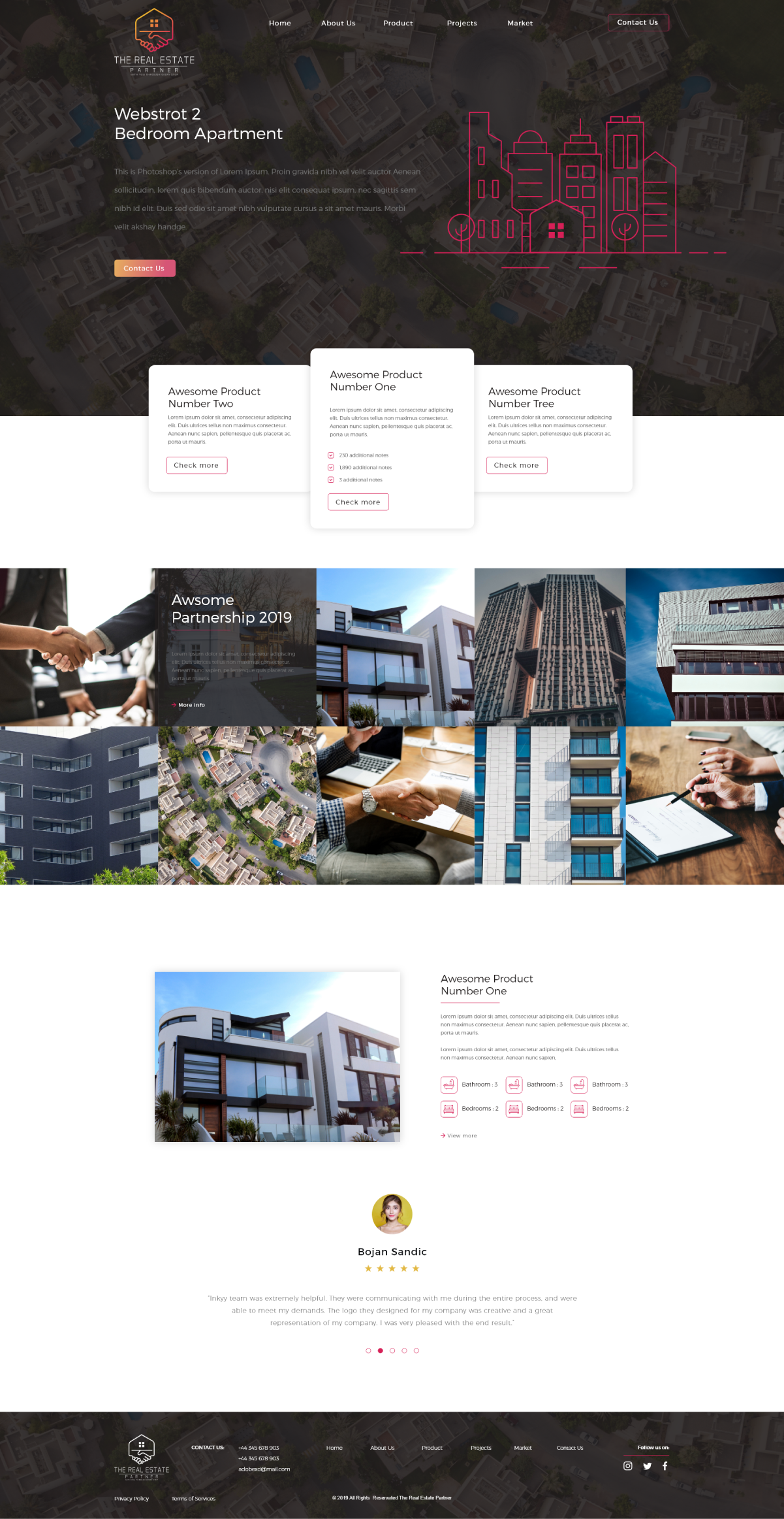
1. The Real Estate Partners
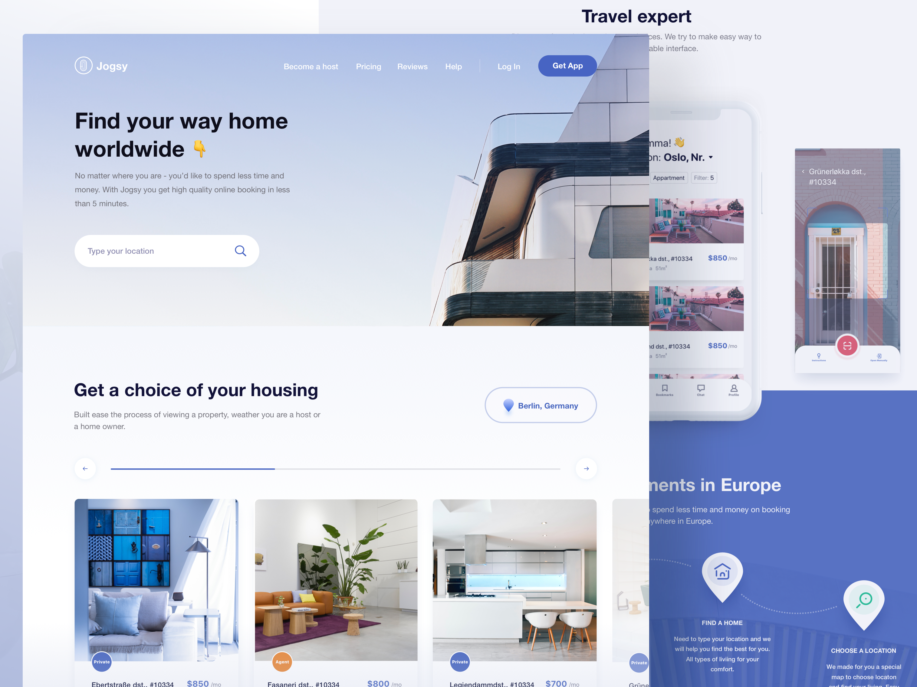
2. Homepage design for Jogsy
3. Luxury Real Estate Website

4. Homepage for property appraisal website
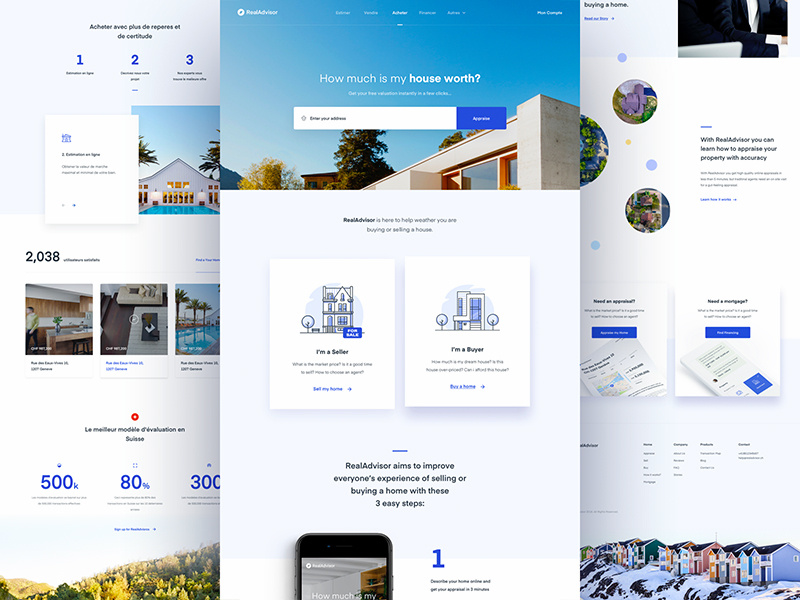
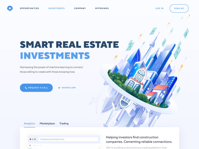
5. Real Estate Investments Home Page
