What makes a great restaurant website? The food industry, in general, is getting more competitive every day.
Your website is one of the most valuable assets. It will help you stand out, attract new customers, and even improve the relationships with your current customers.
We already talked about restaurant logos and the best examples of restaurant logos you can use for inspiration.
Your website will continue to build your restaurant brand, and be there to engage your clients at all times.
Usability is a huge factor, and ease of finding valuable information on the website, like work hours, menu, location, etc.
However, that shouldn’t limit you in any case. Your website is so much more than an online brochure, and you can let your creativity fly free.
Here are the most creative examples of restaurant websites you can use for inspiration:
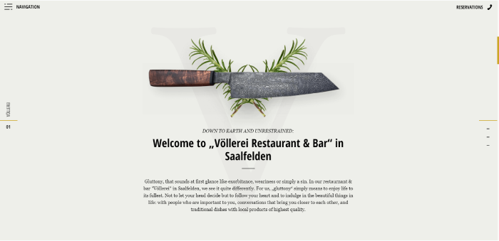
1. Vollerei
A beautiful video of the Austrian Alps followed up by a chef using fresh ingredients to prepare food is enough to make anyone feel hungry.
Slightly longer websites load time is masked by minimalistic intro animation showing a restaurant’s logo.
Pair that up with smooth and fluid on-scroll animations, and you will have the backbone of one of the best restaurant websites around.
On top of that, this website has one of the most creative navigations we have seen.
The designer avoided the ‘standard’ menu and chose to represent each page with a video.
2. Wild And The Moon
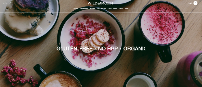
Wild and the Moon is more than an organic, vegan food restaurant. It represents a movement and lifestyle for modern, environmentally aware individuals.
Aesthetics of this website feel like a continuation of those ideas and their brand.
As such, it is a perfect example of how the website should bring value to your business.
3. Vegoshi
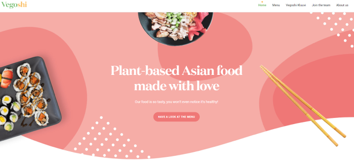
Would you like to see what people mean when they say eye-pleasing colors?
Check out this website for a plant-based Asian food website.
‘Call to Action’ button leads you straight to ordering menu, with delicious-looking food.
4. Shashlikyan
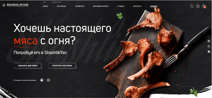
The next example of our list is a restaurant that serves more traditional, barbeque based meals.
It is a perfect blend of traditional and modern web design.
There are just enough micro-interactions to keep the customer interested and guide their attention.
5. Hey Noodles
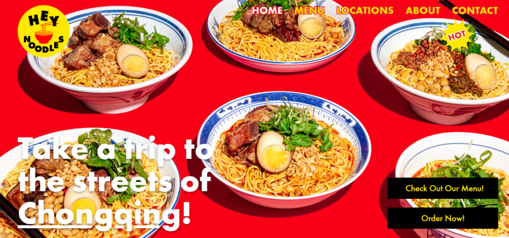
‘Hey Noodles’ combines traditional Chinese color palette with images of fantastic food all around throughout the website.
You can argue that the contrast in colors is too high. However, the website certainly serves its purpose.
6. Eat Genesis
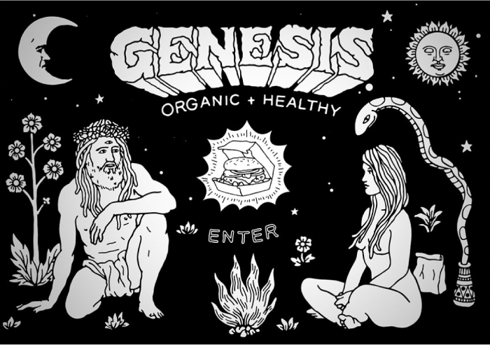
Eat Genesis is an organic and healthy food restaurant website.
It has a very unconventional design, especially when it comes to food restaurants.
There are no actual pictures of food.
Instead, it features Bible inspired illustrations. All of the content of the website is animated, which makes it appear alive.
7. Soho Taco
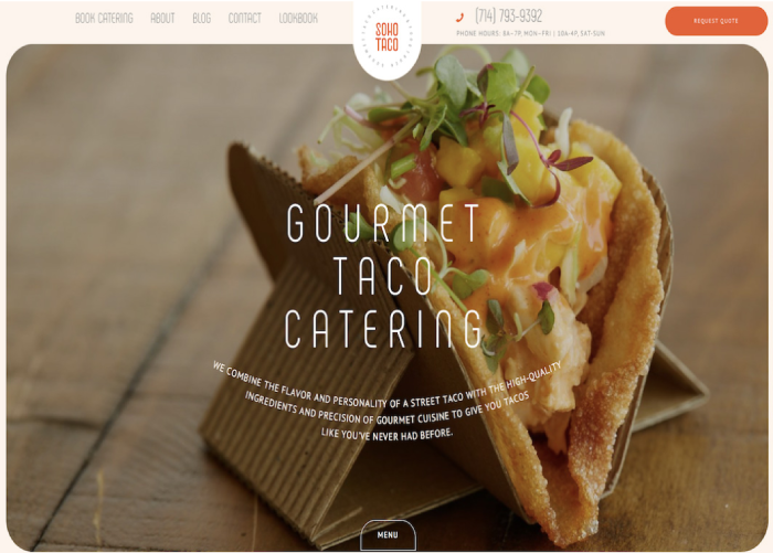
Soho Taco has a very clean, yet sophisticated website. The main focus is on food and user experience.
They managed to capture how good their food looks (and probably tastes), and also showcase other services they provide.
8. Northside Fine Foods
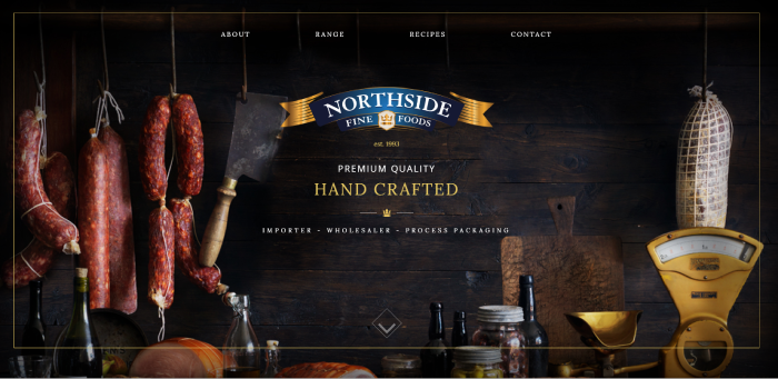
Northside Fine Foods offers premium quality handcrafted whole and sliced smallgoods, meats, and cheeses. You can almost taste these traditional products from wandering around the website.
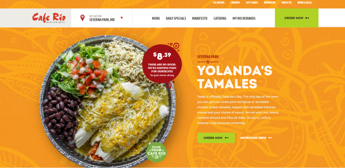
9. Cafe Rio
Enjoy a fresh Mexican food website in a casual atmosphere.
Just like the food, the user interface is fun, colorful, and ‘spicy’.
Still, they managed to maintain a great layout, and the website is easy to navigate.
10. Cook
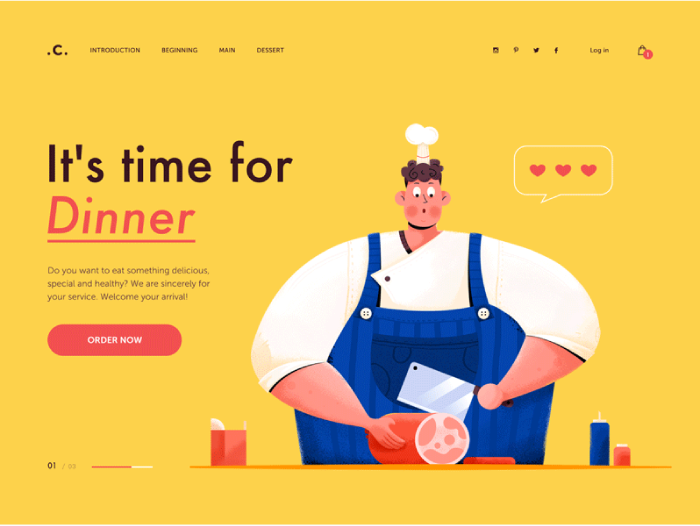
It’s time for Dinner!
Please note this isn’t a website for an actual restaurant.
Still, it’s a great concept that you can use for inspiration.
The cook illustration is animated, which is something the customers love.




1 comment