Lines in Graphic Design
The basic element in graphic design is a line. As a fundamental part of the design, a line is used to add style, create forms, divide space by being a border around other design elements, and much more. You maybe think that a line is a line. There is not much science behind it. But, a line in graphic design is defined a little bit differently. The full definition of a line in art is that a line is a path a dot takes as it moves through space and it can have a thickness as long as it is longer than wider.
Although simple and basic, a line is a vital building block of graphic design that can be used in a considerable number of ways. There are many types and styles of lines in graphic design. Each variation has a place in giving structure, organizing content, leading the eye of a viewer, or invoking specific emotion.
A line is perfectly capable of being used on her own, or in conjunction with other design elements. When used along with other factors in design it can set the mood, indicate texture, or define shapes. Mastering, or at least understanding the lines and their usage in design will significantly elevate and improve your work.
To find out more about other elements and principles in graphic design you should read this article. It has a lot of different and useful information about graphic design.
Main Types of Lines in Design
Lines don’t have to be straight. There are different types of lines, and all of them have their place in design. Some of the lines commonly used in graphic design are defined by the path they take and they can be horizontal, curved, vertical, diagonal, zigzag. In addition to the types of lines, most graphic designers use a variety of line styles. Styles of lines can differ. They can be thicker than others, longer, and even some of them change direction in order to transform from one type of line to another type.
Horizontal
Simple, left to the right straight line. Horizontal lines are parallel to the horizon, and because of that, the name Horizontal Line was born. People would say that they look like they are lying down, chilling, at rest, peacefully. Horizontal lines make users calm & quiet, and evoke a sense of relaxation and comfort.

In general, the viewer associates horizontal lines with stillness or motionless rest. When used in design horizontal lines often make the viewer calm, peaceful, and comfortable. They are stable and secure. Horizontal lines lay at a restful peace. Most commonly used in reassuring the importance of another element, and vital in a structure of a design.
Vertical Line
Vertical lines are at 90 degrees in comparison to the horizon. It is said that a vertical line is filled with potential energy that would end up bursting out if it was to fall over. They are strong and rigid. When creating a vertical line thicker, it is said that they suggest stability.

Vertical lines draw attention to the height. They also show that they lack movement, but they stretch from earth to sky, and further beyond. More than the other types, a vertical line is used to show dignity, strength, and formality. Vertical lines in graphic design are considered tall, elegant, and impressive.
Diagonal Line
It is said that diagonal lines are unbalanced. Diagonal lines can appear to be either going forward (rising) or going backward (falling). They are often associated with action & motion. It seems like they are filled with great energy. Tense & unrestrained energy.

The diagonal line creates tension and excitement, as they seem to move. They are more dramatic than the above-mentioned lines. Giving the viewer a sense of urgency and excitement, this is a type of contour that you should use to direct the viewer’s eye. Additionally, it is a crucial tool for giving depth to design by using perspective.
Curved Line
Curved lines are soft, natural. They remind people of ocean waves. Curved or wavy lines sweep and turn with grace. Curved lines are less definite than straight lines. They change direction and are not so easily predictable.

Wavy or curvy lines are also the most versatile. Smooth, shallow curves represent graceful movement and can invoke calming emotion. This emotion can be even more prominent than in a horizontal line. However, irregular, deep curves represent violence and can have the opposite effect. A good and experienced graphic designer can see these representations of curved lines and can get the most out of them.
Zigzag Lines
Series of diagonal lines joined together makes up a zigzag or jagged line. With its sharp and sudden change of direction, it radiates chaos and wild energy. Diagonal lines that connect at point form this unique line. And what a line it is. Their application is great.

They use the dynamic energy from diagonal lines and create intense movement. Zigzag lines create excitement. They change direction quickly. They change direction frequently. Those movements radiate chaos, wild, unstoppable energy. Keep in mind this. Zigzag lines can imply danger and destruction as they break down.
Styles of Lines in Graphic Design
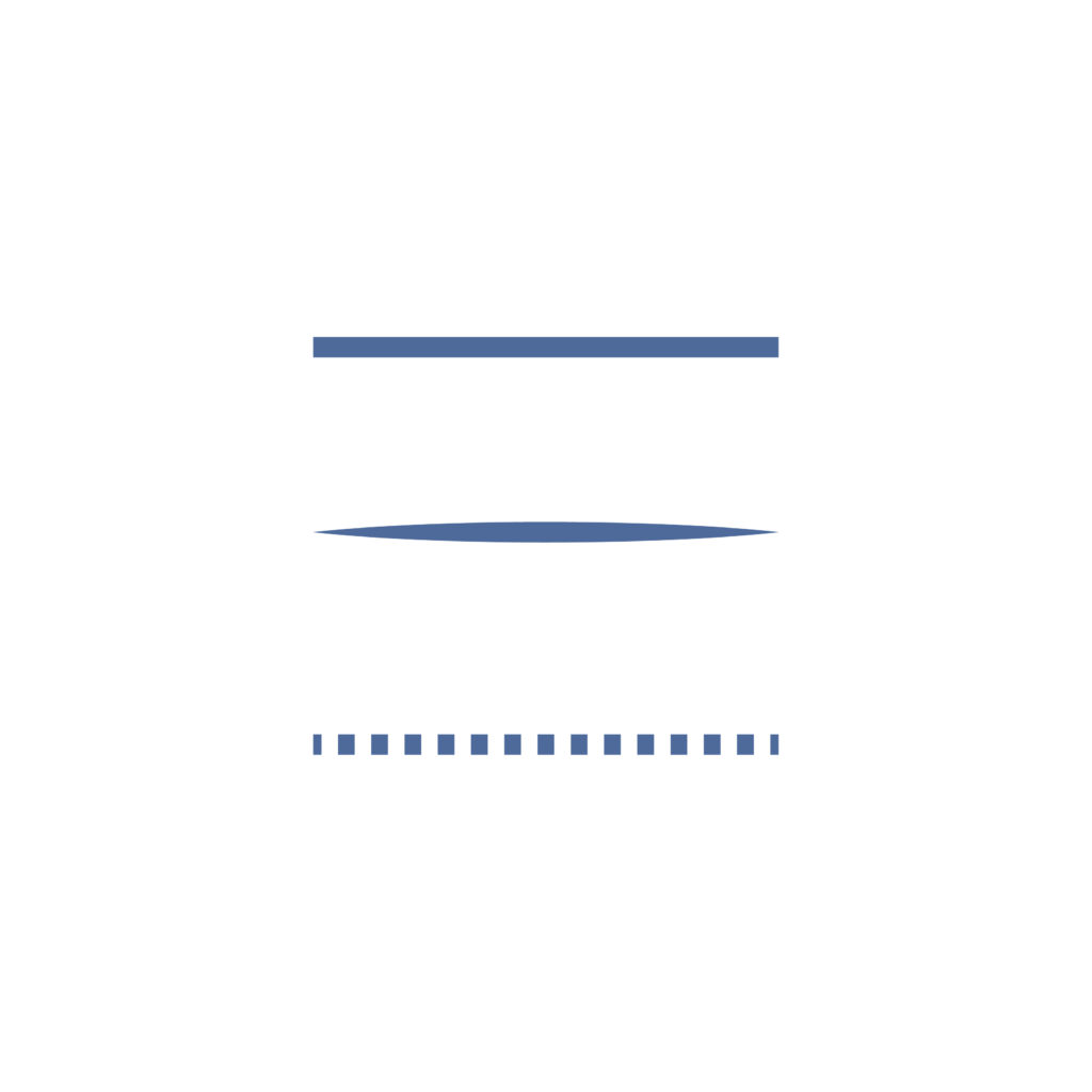
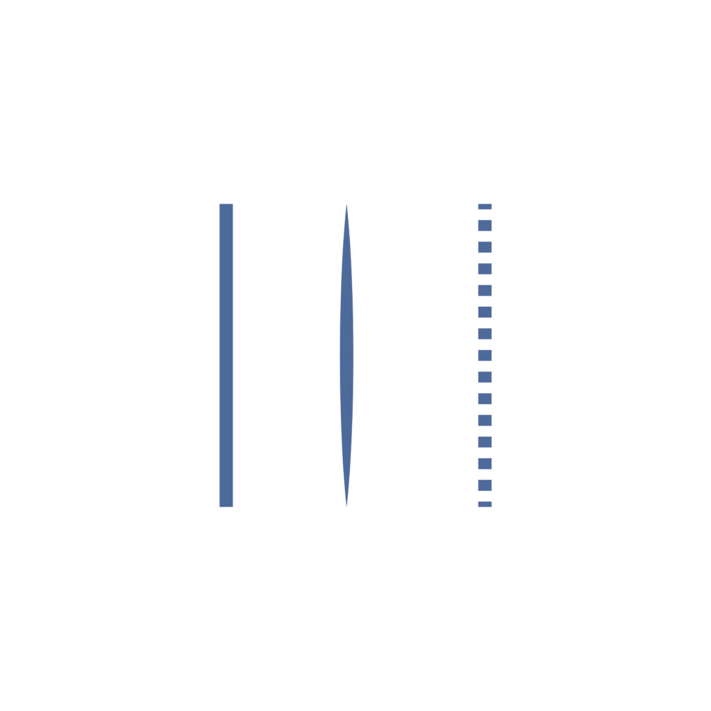
As we briefly mentioned above, there are different styles of lines in graphic design (look at the photos above). There are few style variations that we would like to mention.
- Continuous Lines – These are solid lines drawn from one point to another. This style of line can be any type of line that we told you about, but it can not stop and restart at any point.
- Interrupted Lines – The exact opposite of the continuous lines. The line’s path is there and we see it. It connects two points, one to another. The main difference is that interrupted lines have gaps in illustration along that path. Two common types of interrupted lines are dotted and dashed lines.
- Implied Lines – These lines are different and you don’t draw them. Implied lines exist at the point where one area of color or texture touches another. To simplify it, they have length, but no width at all. Implied lines are there, they exist but are not drawn.


4 comments