A logo is a crucial part of your brand’s identity. It gives you character and helps customers and other businesses easily recognize you.
Major brands in the world, without exception, have logos that are recognized by millions around the world.
Some of the brands like Nike, for example, rarely change anything about their logo.
The other example is Stella Artois, which has a logo that can be traced back to the 14th century.
Finally, we have a famous ‘Amazon’ logo which stuck around since first introduced around 2000.

It’s tough for a logo to stay relevant over that long period. More often than not, the logo should be tweaked and adjusted to keep up with the other brands.
When should you do a logo refresh?

Logo refresh is a far safer approach than a full logo redesign but can have a similar effect.
Refresh will enable you to keep the essence of your brand without
starting from scratch.
With that said, you should be careful with just following the latest design trends. There is a reasonable chance the feedback you receive isn’t exactly what you expected.
You need to carefully plan and execute changes to your logo or any of the brand assets. It is useless to rebrand or refresh your logo without a clear purpose.
Before you commit to the refresh, you should consider the following:
- Does your logo look good compared to your competitors?
- Has your business changed significantly since your last refresh?
- Were there any significant changes to your audience demographic?
- Are you releasing a new product or a service?
How to successfully refresh your logo?
There isn’t just one method, or one approach when it comes to logo refresh or design in general. You can let your creativity loose and do whatever you want.
Unfortunately, there also aren’t any guarantees you will be successful in your efforts.
Here are some of the tested and failproof ways you can use. Additionally, we presented examples of brands that successfully used these methods to refresh their logo.
Change or Update the Colors

Colors always were a significant part of creating a brand. Countless studies were made to explain the exact impact each color has on the majority of the population.
80% of people believe that colors play a pivotal role in brand recognition.
Still, even colors can feel outdated and no longer represent what your brand stands for.
Or, you decide to change the direction of your company and move from strictly corporate to a more approachable course.
One of the trends we can see often is brands switching up to flat colors.
Check the comparison between Starbucks ‘ old and new logo. Notice the difference in colors and design?
Switch up the Fonts

When it comes to fonts, the pendulum seems to always swing between Serifs and Sans Serifs.
There is a regular change in styles. Your new choice of typography can quickly become boring, or out of style every 2-3 years.
Switching up the font of your logo is often the easiest and most reliable way to approach a logo refresh.
Again, we come back to the ‘Google’ example. They replaced their recognizable Sans Serifs font for a Serif.
This change alone revived its logo in terms of looking friendlier, fresh, and modern.
Simplify the Design

Nothing much can be said about this method. Your logo doesn’t have to explain every single detail of what you do. A message can be shared with far fewer colors, fewer bits and pieces, and a much shorter tagline(or no tagline at all).
Use the Power of Nostalgia

Nothing beats nostalgia when it comes to connecting with a lot of people on an emotional level. Memories are highly selective, and people choose to remember only the best things. More often than not, subtle details in design can bring out the familiar sentiments of the ‘good old days’.
This is a perfect opportunity for brands that have a rich history but feel tired, or out of the spotlight.
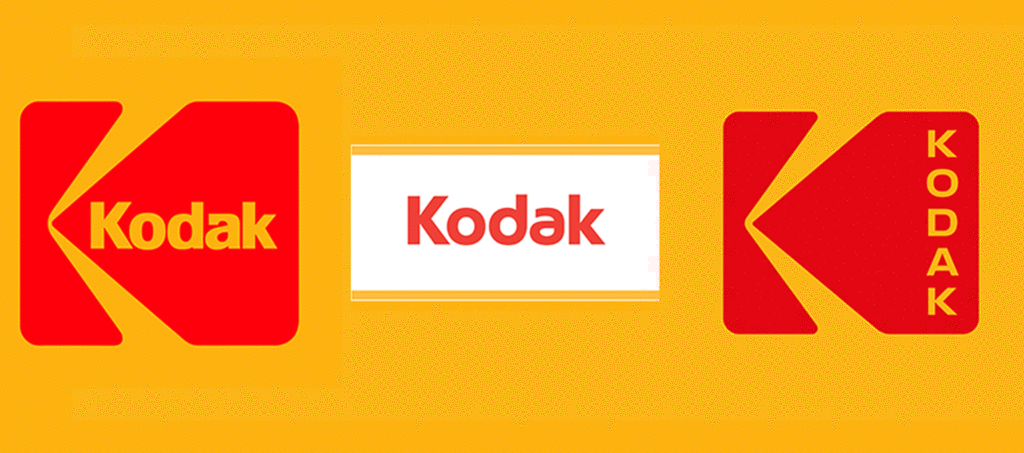
Logo refresh doesn’t necessarily bring new design solutions. You can see above how ‘Kodak’ brand utilized this method.
Conclusion
The logo is the most recognized, and certainly one of the most important elements of your brand.
As such, people easily establish emotional connections or make assumptions about you just by looking at your logo.
It is a fact that design trends and tastes change over time and it’s a good idea to keep up with them.
Keep in mind that any change can have both positive and negative reactions.
The best practice is to carefully test and plan your approach before fully committing.


