Many marketers confuse the difference between a landing page vs product page. But understanding these crucial terms is essential for maximizing your marketing efforts.
A product page usually grabs the cold audience, which might be hearing about your product for the first time. That’s why they are information-heavy.
Once this cold audience is turned into warm by rigorous advertising, a landing page is used to convert them into leads without doing any heavy lifting. That’s the reason landing pages are so minimalist.
On-site, the conversation rate of landing pages is 26%, higher than the product page (7.91%).
But that higher conversion rate of the landing page is due to the power-lifting done by the product page in taking your audience from the unaware stage to the aware stage.
So you need both in your marketing campaigns. That’s why it’s important to understand the difference between the two. So you can know when you should use a landing page vs product page.
In this article, I’ve broken down all the differences between a product page vs landing page. And relevant examples are given so you better understand the crucks of both.
Let’s get started.
Landing Page vs Product Page Comparison
“Landing pages are designed to generate leads for specific marketing campaigns while product pages provide information about your products, brand, or services.“
Before we go into detail, let’s first understand the landing page and product page separately.
What is a landing page?
Landing pages are single-focused web pages that have only one aim. To lead the visitor directly into your sales funnel.
Landing pages are highly curated and have very little information on them. It removes all those distractions from your customers and gives them a clear, consistent message. They only have one CTA backed up by an irresistible offer.
Landing pages often use lead magnets. Lead magnets are that free reward you give your customers in exchange for their contact details. The lead magnet landing pages are essential for your marketing campaigns.
We’ll discuss more examples of landing pages below, so make sure to stick to the end.
As discussed above, landing pages are more converting because of their minimalist design. They provide the customers with what they need without beating around the bush. But this is where it gets interesting.
How can your potential customer buy or opt into a product through your landing page when he is completely unaware of your brand?
Will the landing page offer the same conversion now? Well, this is where product pages jump in. It provides all that push to drive your audience from sitting on their couch to opening your website and clicking that Buy Now button on your landing page.
But there’s more to the product pages.
What is a Product Page?
Product pages are where all the magic happens. They take your audience from attention to interest to desire and then finally take action by clicking the CTA (which usually leads to a landing page).
Product pages provide all the information required about your product. The aim is to educate your audience. That is why the length of these pages can range from 1500 to 4500 words.
This includes
- Visual image
- Copywriting framework
- And testimonials too to support your claims
From emotionally connecting to the customer’s pain points to presenting your product as the best solution. Product pages are very important for your marketing techniques.
Since the audience might be completely in the awareness stage, product pages have more CTA’s compared to landing pages to create the continuous TOM (Top of the Mind Recall) in the minds of your consumers.
Landing Page VS Product Page: Comparison Table
| Landing Page | Product Page | |
| Purpose | Convert visitors into leads or customers | Showcase and provide detailed information about a product |
| Objective | Encourage a specific action | Facilitate product discovery and purchasing |
| Focus | Single, focused objective | Comprehensive product details |
| Distractions | Minimize distractions, remove unnecessary elements | Provide additional information, related products |
| Content | Concise and persuasive content | Detailed product descriptions, specifications |
| Navigation | Minimal navigation links | May include navigation links to other product categories |
| Visitor Intent | Encourage specific action based on the marketing campaign | Research and evaluate a particular product |
| Conversion Rate | Higher conversion rate due to focused objective | The conversion rate depends on the product and presentation |
Examples of Landing Page vs Product Page
To better visualize the difference between the product page vs landing page, see the examples below.
Express VPN Landing Page
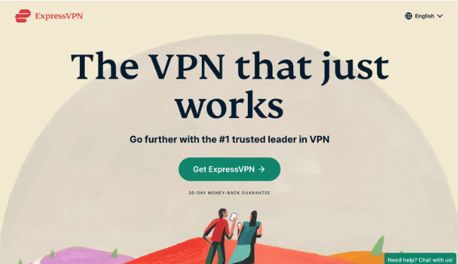
Here’s the landing page of Express VPN. What can you see on this landing page? What type of information does it provide?
Your answer can be
“Some kind of VPN,”
Right?
But does it educate about the pros and cons of Express VPN? Does it offer its competitor’s analysis? Does it have multiple CTAs?
No! Because the aim is not to educate. It’s for a warm audience that already knows the services of express VPN and how it differs from a pool of VPNs.
And that’s the difference between a landing page vs a product page. Here the only CTA is Get ExpressVPN, and the only focus is to get conversions out of the CTA by subscribing to the VPN.
And this landing page will have higher conversions than the VPN product pages. This is where landing pages are so good.
A sleek design with minimal but targeted information makes a good landing page. Now let’s look at a products page.
Jay Training Product Page
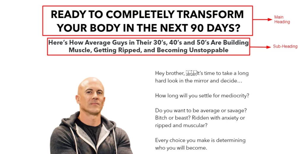
So this page starts with a neck-bleeding headline and subheadline to educate the readers. And then, the writers talk about the pain points of not having a good body by using killer storytelling.
Got the point?
The only aim is to take the readers from the problem stage to the problem-solving stage. If we scroll down, we can see a bulk of information coming in.
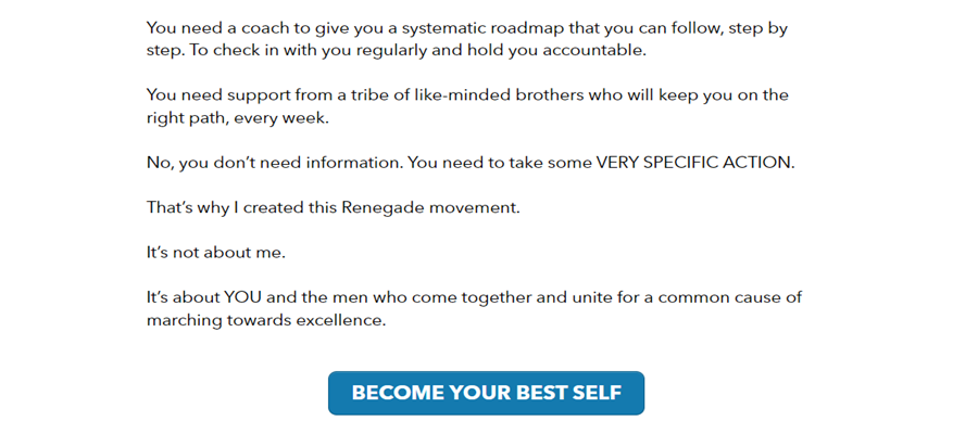
See! The product page follows the AIDA framework and emotionally connects with its customers to buy their product.
And after taking their audience to the awareness stage, here comes the first CTA, followed by five more.
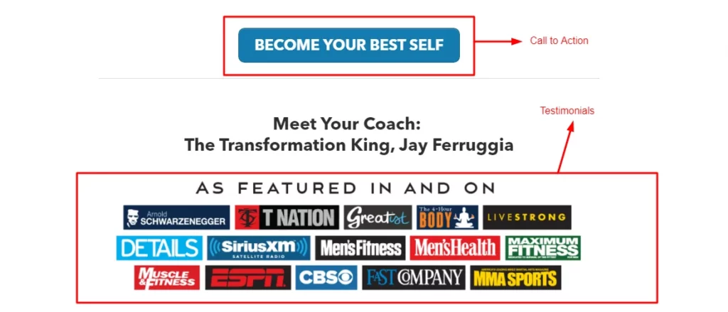
That’s how a product page or sales page works. It is designed to do all the heavy lifting required to create an irresistible offer for the landing page.
Now you may wonder. If there’s loads of quality information on the product pages, why are they less converting than landing pages?
Well, the answer lies in the question. Product pages aren’t there to convert. They are good at building your brand identity, which is what they are doing.
CTAs for Landing Page VS Product Page
A call to action(CTA) is the ultimate reason for creating landing and product pages. Landing pages usually have a single CTA. Since the audience coming to it already knows what they are buying.
They don’t need more push but just an irresistible offer that can be given through discounts etc.
Some popular CTAs for Landing Pages include
- “Get started today.”
- “Claim your free trial.”
- “Download your ebook.”
- “Subscribe to our newsletter.”
- “Unlock exclusive content.”
On the other hand, product pages have multiple CTAs. You may find one after the product features, another after the competitive advantage, and one more at the end.
The goal is to grab both the eyes of the consumer on our product and to make them understand.
“Why our product is the ideal solution for them.”
Here are some common product page CTAs
- “Shop this product.”
- “Explore options”
- “View pricing and details.”
- “Find your perfect fit.”
- “Add to Wishlist”
- “Discover more products.”
When to use a Landing Page Versus a Product Page?
While product pages are great for educating your customers, they are not as converting as landing pages. So if your marketing goal is to build a brand identity first, you can advertise your product pages.
But remember, don’t expect thousands of leads coming straight into your business within a month. It takes time.
But suppose you have a decent audience pool, and the goal is higher conversions. In that case, you need personalized sleek landing pages. That provides one irresistible offer to hammer the last nail in the coffin of your consumer’s buying process.
But what makes a killer converting landing page?
The landing page will be your consumers’ first impression after diving through the marketing funnel. So it needs to be engaging, creative, and at the same time, results-driven.
You can’t just create a landing page by designing some templates in online graphics tools. It needs quality research alongside perfect execution to lure in eyeballs and convert them into paying customers.
Here’s what makes a landing page highly converting
- Clear headline: Grab attention with a concise and compelling headline that highlights the main benefit.
- Engaging visuals: Use high-quality images or videos that are relevant to your offer.
- Persuasive copy: Keep the content concise, persuasive, and focused on the benefits.
- Strong CTA: Make the call to action clear, prominent, and compelling.
- Minimal distractions: Remove unnecessary elements to keep visitors focused.
- Social proof: Include testimonials and reviews to build credibility.
- Responsive design: Ensure the landing page is mobile-friendly and loads quickly.
- A/B testing: Continuously test and optimize elements to improve performance.
- Clear value proposition: Clearly communicate the unique value to visitors.
Ahh, so much to do.
With the bulk of your marketing efforts, it would be great if there was a quick online generator that does all the heavy lifting and provides you with a customized landing page within days without breaking the bank.
Right?
Well, this is no more than a dream with Inkyy’s professional landing page services.
Get Professional Landing Pages Designed by Inkyy’s
At Inkyy, we take all the stress from your shoulders. We create compelling and professional landing pages that take the lead over your competitors and win customers. No more low converting rate and boring audience engagement.
With our lending services, you can rest assured of sitting on your cozy sofa while drinking a steaming cup of coffee. You’ll get your landing page served in a few days.
Want to know how? Let’s schedule a 30 min meeting and begin transforming your conversion rates.
