Logo presentation, and leaving a great first impression is one of the crucial moments in every successful project.
Your design may be solid, and you have researched it thoroughly.
Still, if your presentation isn’t professional, you can have overly negative feedback.
Every designer needs to have multiple logo presentation templates for every occasion and type of project.
Here are some of the best examples that can make an impact on your workflow.
1. Blurred Background Image Logo Presentation
Here is one of the most straightforward ways to present your logo.
Find an image that is related to your logo in some way. It could be a similar design idea, complementing shapes, or colors.
Additionally, a great photo or an image will help you set the right mood.
You can find thousands of royalty-free stock photos on websites like unsplash.com.
All you have to do then is to apply your logo. Consider adding a blur effect on the background image to concentrate attention on the logo itself.

2. Visual Explanation of The Logo
‘How did you come up with that?’ is a question many designers don’t like to hear.
It isn’t very enjoyable to explain the whole process or a moment of inspiration when it comes to creative work.
By presenting your work this way, you will be able to avoid that situation.
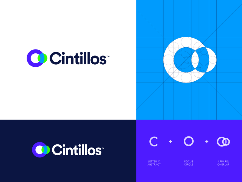
Here we have an example of precisely that.
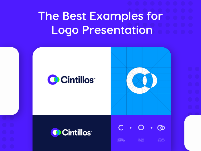
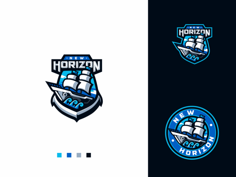
The designer presented a primary logo, an inverted color logo, an outline grid, and a simple visual explanation with essential elements.
3. Inverted Color Options Presentation
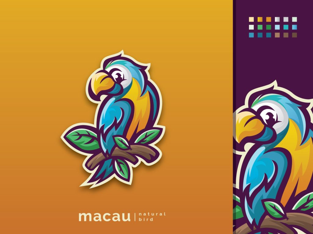
Here is an option you can use that works excellent for mascots. Also, you can use it for logos meant to be used on various color backgrounds.
This particular designer added just a bit of a drop shadow effect to make a mascot ‘pop’. On the right side of the screen is a mascot on a darker background, and of course, a color palette.
4. Multiple Logo Variations
Can’t decide which version of the logo looks better?
Simply lay them all out on the artboard and let the client decide.
This style of logo presentation works well if you already have to design multiple variations or styles (vertical, horizontal, inverted color, badge, etc.)
5. Background Logo with reduced opacity
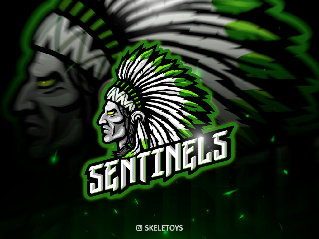
Similar to adding a background image, adding the actual logo to the background will look even better.
Scale the design, reduce opacity, and send it to the back.
6. Colored Bottom Line with Color Palette
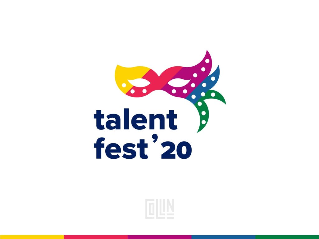
This is one of the most straightforward ways to get away from the blank artboard. Present a nice and clean logo design is adding a colored bottom line.
Not only that, but it can provide contrast and serve as a creative way to present the color palette used.
7. Logo Wireframe Presentation
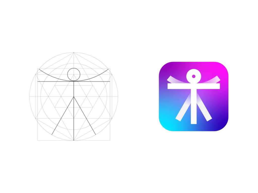
Geometry is an essential factor when it comes to designing a logo.
Then why shouldn’t you show how carefully planned out are your designs? It will help you show your work in a much more professional way.
Feel free to make a beautiful logo presentation, with a finished product and initial wireframe right next to each other.
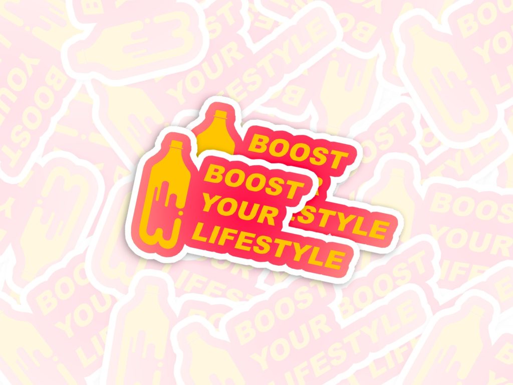
8. Sticker Bomb
Knowing where and how your design is going to be used is a big part of the process anyway.
In this case, it is in the form of a sticker.
Take that opportunity to present it as a sticker bomb. It will look more natural, and your client will love it!
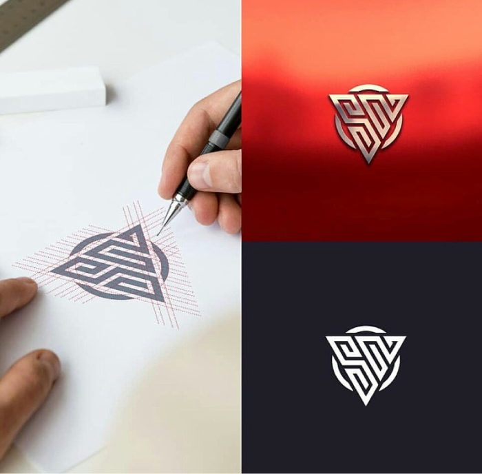
9. Logo Sketch
With a sketch of the logo with gridlines, 3D looking mockup, and simple white on black background, this logo presentation has it all.
Keep in mind that sometimes less is more, and to use this way of presenting sparingly.
10. Hand Drawn Logo Sketch Presentation
Designers sometimes argue if sketching out your logo by hand first is necessary. Even more, if your client should ever see your sketches and initial ideas.
However, this is the way to go if you are on an extremely tight schedule, or have to work with superficial information.
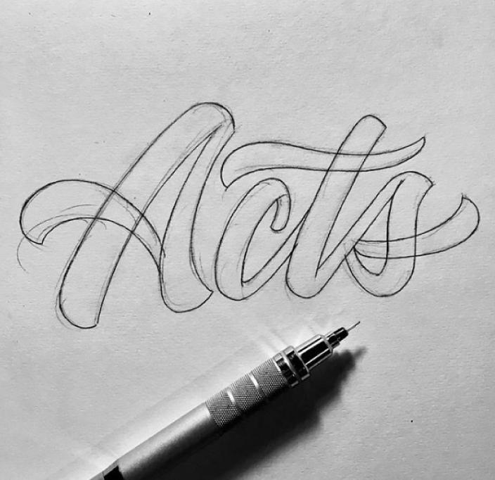
It will help you get started and test out which direction to take before you fully commit and deliver a final presentation.
