What makes a perfect logo for any Real Estate business? Real Estate industry is riddled with the same ‘stock’ designs and bland fonts and colors. This article will help you recognize the most common and essential elements you should use, and still be creative and original.
Slight variation in color, shape or even type of architecture used will allow you to target a specific type of customer.
House Icon
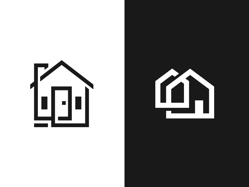
House silhouette, roof, door, and windows are simbols that are often used for residential property logos. Classic and to the point, it’s no wonder why most logos in this niche are based on these elements.
As a result, it is increasingly harder to stand out, and designers have to use all of their creative energy to design something special.
Here are some of the best creative solutions we found.

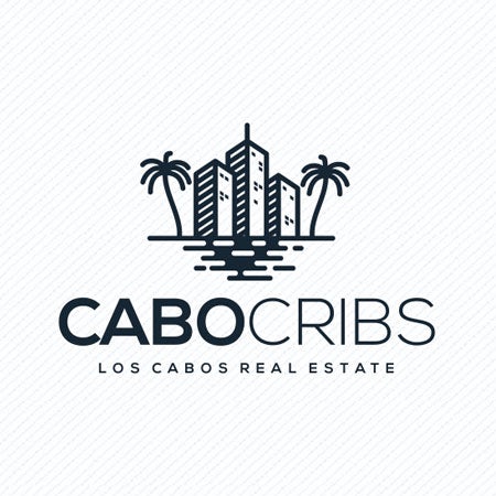
Skyscraper Real Estate Logo
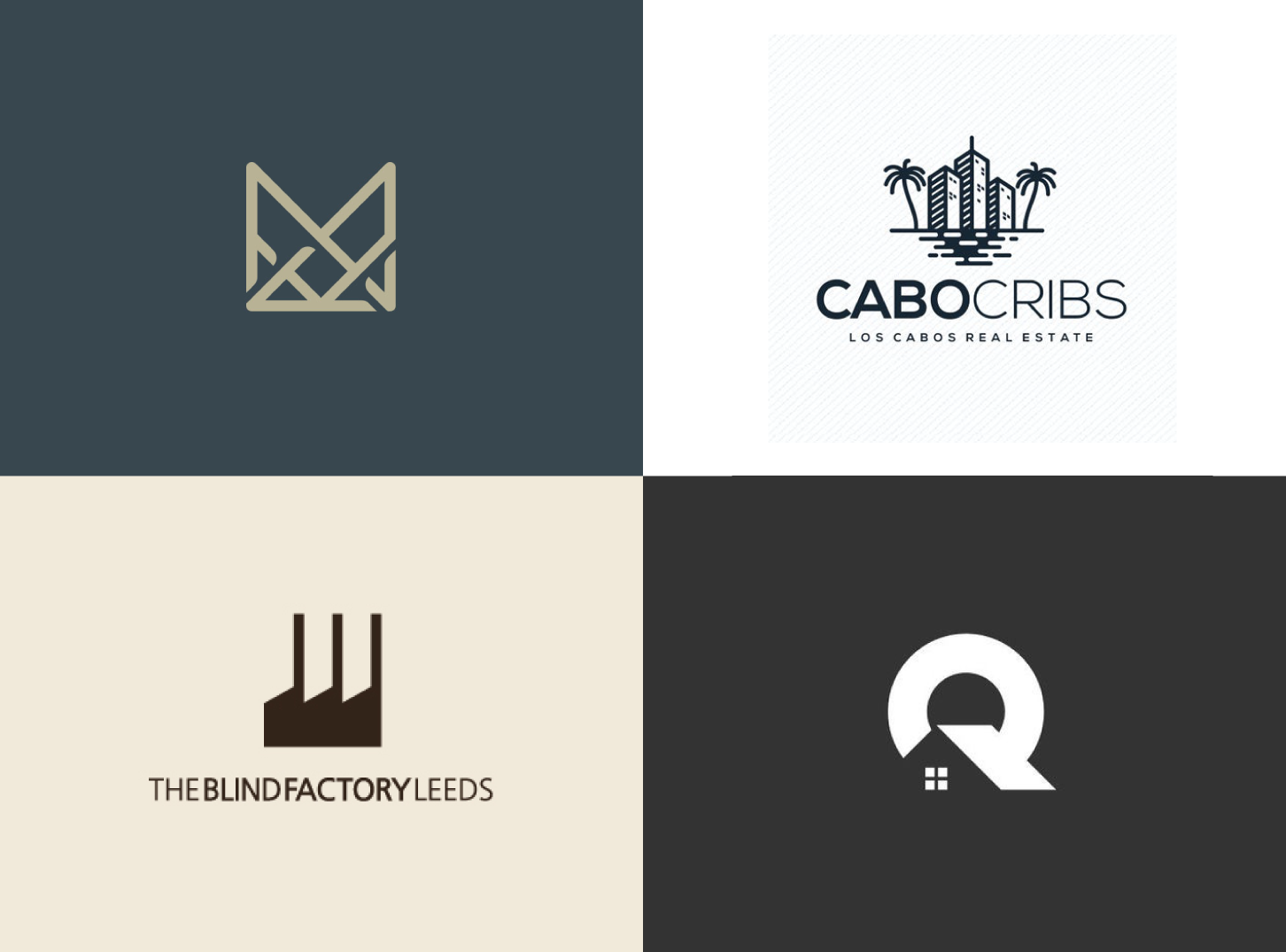
Tall buildings, hotels, and offices are great symbols for commercial real estate logo. Together with simple colors, commonly used blue color and elegant font.

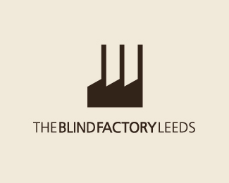
Industrial Real Estate Logo
Strong lines and colors, a factory silhouette in an edgy, angular shape and dark color. These are some of the most effective and standard characteristics of designs for this niche.
by
Key Icon Real Estate Logo
A clear symbol of strength and security, key based icon for your logo will give your customers great confidence in you and your business.


Initials based Logo Design
Company name or Real Estate Agents name initials is always a solid idea for a logo.
It is a classic, elegant solution that will continue to be relevant. Additionally, it will allow you to be a lot more flexible with your business, and types of real estate you sell.


Land Sale Logo
Real estate logo for land sale companies and agents often stand out from other designs in this niche.
Designers often take inspiration from nature instead of buildings or cities.
Land Sale Real Estate logos are distinguished by having elements that represent cattle, grain, hills, sun, etc.
They are mostly known to incorporate rich green color symbolizing vegetation and brown color that symbols earth. Overall, the colors used should be bright and lively.


Conclusion
Although famous (or notorious) for using classic and similar imagery, there is still a lot of room for creativity in this niche.
If you need help with branding your business, or your website feel free to contact us here.



2 comments
krisbrassard6
I have read so many articles or reviews regarding the blogger lovers however this piece of writing is really a fastidious piece of writing, keep it up.