The constant pursuit of the latest trends doesn’t always have to be a good thing, especially in the world of design that has such a rich history. Sometimes, a vintage look can be just what your brand needs to stand out in the sea of logos that follow the same well-established patterns. A retro logo celebrates the age when computer-generated designs were a far-fetched dream and every letter or symbol had to be hand-drawn. In addition, a vintage logo can suggest that your brand embraces the traditional values and presents them in a contemporary setting.
Types of vintage logo
The diversity of different types of logos is simply stunning as you can choose from stamps, badges, various geometric shapes, hand-drawn illustrations, line art and many more styles of logos. For instance, badges and stamps are an excellent option for all brands that want to feature their logos in the pictures of their products. These types of vintage logos enable companies to emphasize the personal attention they dedicate to the creation of their hand-made products that have become a rarity in our age.
The logos that were used in the first couple of decades of the 20th century often featured complex hand-drawn illustration that captured the viewer’s attention through symbolic imagery. Creating such a vintage logo today can be a challenge for designers who are accustomed to using digital technologies to produce their designs. Reminding a company’s target audience of the time before mass-production of goods became common can be an effective way of suggesting that each of their products is custom-built. Adding a touch of authenticity to a company’s logo can be a great marketing move that potentially leads to building a unique visual identity the customers aren’t likely to forget.
These types of vintage logos are easily added to a broad spectrum of backgrounds that range from brick walls to canvases. A simple monochrome background often highlights the retro look and feel of the logo and adds a context that makes easier for the viewer to understand the designer’s intentions. In the age of digital images, using hand-drawn illustrations as logos is becoming increasingly popular which suggest that values like skill, talent or attention to detail never go out of fashion.

Typography in Vintage logos
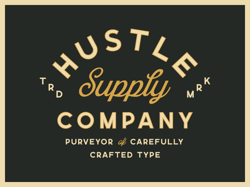
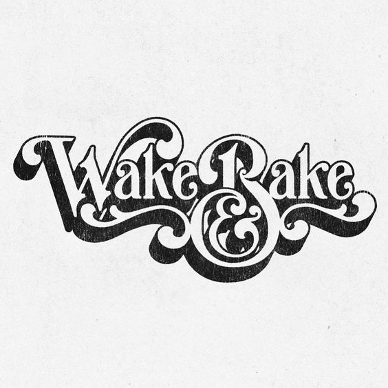
Typography is such an important element of every logo, even today when there are so many pre-designed fonts available for download on the Internet. Despite a huge number of digitally created font styles, handwritten fonts are as effective as they were a hundred years ago and they are commonly featured in logos of companies that want to add a personal touch to their branding. The handwritten logos have never really lost their charm because they suggest that creativity, originality, and authenticity are the principles a company supports.
Even though using a handwritten font as a logo can help a brand gain recognition, it is still better to combine these typefaces with strong, memorable imagery that clearly represents the products and services a company offers. There are so many different styles of vintage and retro logos that can be used as a basis for developing an authentic logo for a brand. However, finding a way to incorporate these styles into a contemporary setting is the true challenge designers face, as it is relatively easy to produce a logo that looks anachronistic.


 Book a Meeting


