Picture this: You’re a family lawyer, your suit is sharp, and your expertise unparalleled.
But in this digital era, the spotlight isn’t in the courtroom; it’s on your website. It plays judge, jury, and sometimes, the executioner of first impressions. In fact, a staggering 94% of these impressions hinge on web design.
Your website needs to be more than just good. It must pop out of the digital clutter and say, “Here’s a law firm that cares, that’s professional, and that can help.” and not, ‘Here’s another drab law site lost in the sea of mediocrity.’
But, how do we make the client really believe that? That’s on the shoulder of web design for family lawyer!
From the nuts and bolts of responsive web design to the juicy tidbits of the informative website content, every pixel and punctuation mark is an actor in your law firm website design.
Now, you are actually convinced of how important web design for family lawyers is. So, let’s make one!
Stepwise Process of Web Design for Family Lawyer
Below I’ll give you a complete breakdown of the website design process for family lawyers. By following this guide, you can create a highly converting website without any hassle.
1. Who’s Your Ideal Client?
Take a moment and see who you are going to serve. What drives them to a family law firm website?
Here’s an idea:
- Encounter David and Sarah, a married couple in their late 40s. They are looking for an experienced family lawyer to handle their estate planning needs and draft their will.
This gives you an idea of who actually is coming to your website. This is called the buyer persona!
Still confused about how to make a buyer persona for your attorney website design? Consider these questions:
- What specific information does your target audience seek on a family lawyer’s website?
- Consider the demographic characteristics of your audience. Are they young couples starting a family, or older individuals seeking guidance on wills and estates? Do they live in urban areas or small towns?
- How do they navigate the online realm? Are they tech-savvy or prefer traditional channels?
- What do they feel when seeking legal help in family matters? Are they anxious, hopeful, or confused?
- What motivates them to seek the services of a family law attorney? Are they driven by a desire to protect their children’s best interests, resolve conflicts amicably, or secure their financial assets for the future?
Take a snapshot of the answers to these questions. This will serve as the basis of your website design for family lawyers.
2. Choose The Right Web Designing Platform
Being a family lawyer, who’s just about to appear in court, you would not show up in a joker’s costume, right?
Just like dressing appropriately for the occasion, choosing the right web design platform is crucial for your website.
Consider these factors when choosing a web platform:
- Professionalism and Aesthetics
Firstly, you want a platform that exudes professionalism and ease of use.
Think of Wix or Weebly as your trusty tailored suits. They offer drag-and-drop interfaces that make it a breeze to create a sleek and polished website, without the need for coding expertise.
You’ll present yourself as a top-notch lawyer right from the digital doorstep!
- Customization
If you are someone who just loves creativity and likes one element of one theme and a second element from the other theme, WordPress can serve the purpose.
With themes like “Legal Luminary” or “Justice Jedi,” you can personalize every aspect of your website, from fonts to color schemes, ensuring your online presence matches your unique brand identity.
With WordPress, you’re not limited to pre-designed templates. You can mix and match design elements, rearrange content blocks like building blocks of legal prowess, and add eye-catching visuals to create a website that’s as visually arresting as a courtroom drama.
Want a sleek gallery to showcase your victories? WordPress has got you covered. Need a testimonial section that leaves your clients in awe? Consider it done. The possibilities are as endless as your legal brilliance.
Oh, and let’s not forget about plugins! Think of them as your trusty sidekicks, enhancing your website’s functionality with a simple click. Need a contact form for potential clients to reach out to? There’s a plugin for that.
How about an appointment scheduler to streamline your consultations? You got it!
With WordPress, you can supercharge your website with plugins that make it a legal powerhouse, delivering a seamless user experience and showcasing your expertise.
- Mobile-Responsiveness
Picture this: your potential clients are busy parents on the go, juggling kids and legal matters. They’re most likely searching for a family lawyer on their smartphones.
To capture their attention, you need a mobile-friendly platform like Shopify.
With its sleek and optimized designs, your website will look fantastic on any screen size, making you the go-to lawyer for modern families on the move!
- Search Engine Optimization
Do you want to be as visible as a neon sign in Times Square?
Platforms like Squarespace come to the rescue with SEO-friendly features, guiding you through the maze of metadata, URL structures, and analytics integration.
Besides this, WordPress comes with special SEO plugins like Yoast SEO and RankMath which makes it another great option!
- Security Assurance
Support and security are like having a reliable legal team by your side.
Platforms like GoDaddy, Bluehost, Site Ground, and DreamHost offer robust security measures and round-the-clock customer support.
From SSL certificates and malware scanning to site lock to protect your client’s data, they’ll keep your website safe from digital threats while providing expert assistance whenever you need it.
It’s like having a trusted legal assistant guarding your digital fortress!
3. Craft a Compelling Brand Identity
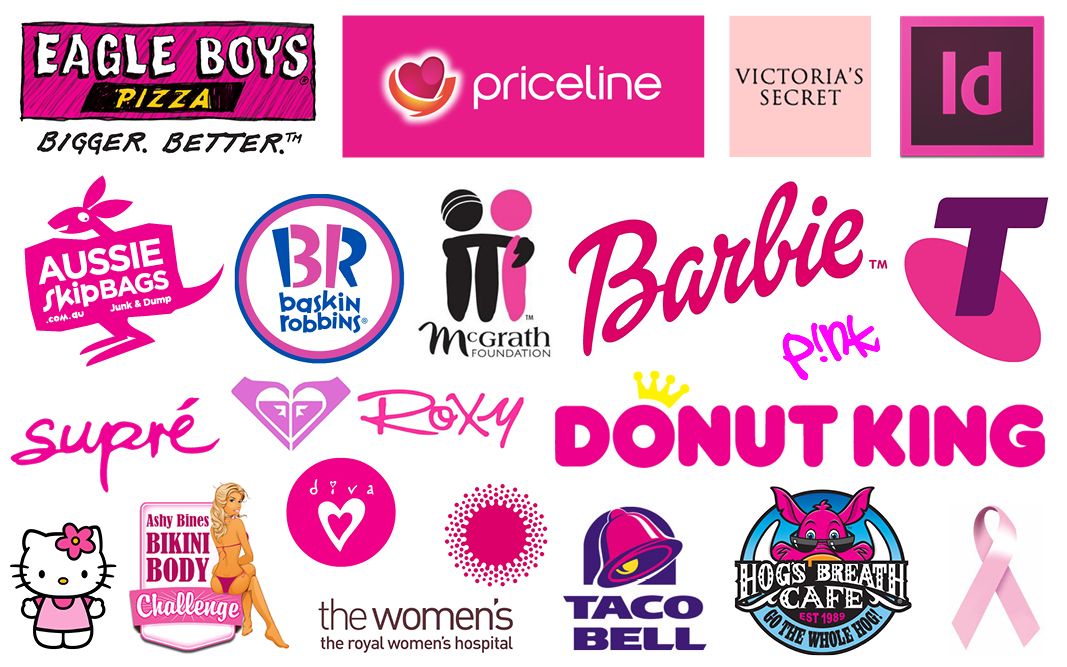
- Understand The Color Psychology
Imagine you’re at a party, right? A fancy-dress party, no less. The first thing you notice about anyone is their costume, their color scheme.
The lady in vibrant red and gold is probably not going to be the wallflower. The gentleman in cool blues and purples? Probably more calm, composed, maybe even a touch mysterious.
This is exactly how your brand’s color scheme works. It’s like the costume your brand wears to the world’s largest digital party; the internet.
Let’s look at an example. Google. Those primary colors of blue, red, yellow, and green are synonymous with the brand now. They’re lively, energetic, youthful, and innovative. Now, that’s cool for Google, a tech giant.
A Possible Color Scheme For Your Website:
Now, take a minute and shift the situation to your family lawyer web design. You’re not the uptight, all-business, suit-and-tie type.
You’re approachable, compassionate, and above all else, you genuinely care about your clients. So, how do you translate these feelings into a color scheme?
To make your website feel warm and welcoming, you could opt for a soft, comforting color like a light blue or a pastel green. These colors symbolize tranquility, safety, and harmony.
But hey, you’re also reliable and professional, right? You’d want to communicate trust and dependability. A strong navy or a solid gray could do the trick here.
Now let’s jazz it up a bit with some accent colors. You’ll want something that expresses your passion for helping families. How about a pop of vibrant orange to represent enthusiasm and determination? It’s like the zesty orange juice at breakfast, a bright and cheery start.
So, let’s assemble our costumes. You have light blue or pastel green as the main color, setting the stage as the inviting, calm host. Next, you have navy or gray, reinforcing your trustworthiness. And then, the accent orange, bringing in that fresh, determined vibe. AND VOILA!
- YOUR VERY OWN LOGO
When you see the sleek black bat silhouetted against the moon, you immediately know it’s Batman. The moment you spot that big “S” inside a diamond-shaped shield, you can tell it’s Superman.
These superheroes’ identities are tied to their logos, and just like them, your brand needs a unique symbol to stand out.
Now, being a family lawyer who untangles complicated legal issues, who fights for justice, who brings families peace of mind, how could you not have that very particular ‘big S’ that reminds people of you?
A Logo Suggestion For a Law Firm Website:
Picture a logo that consists of a sturdy oak tree. Now, why an oak tree, you ask? Well, an oak tree represents strength and reliability, and it grows from a tiny acorn to a towering titan.
As a family lawyer, these are qualities you’d want to be associated with your brand.
There’s more to this. Imagine integrating a small, delicate nest amidst the branches of the oak.
Why a nest? Because it symbolizes family, protection, and warmth – things that a family lawyer promises to provide.
See what we did there? We took elements that symbolize the values of a family lawyer and combined them into a unique logo that tells a story. A story of strength, protection, and family.
This logo, in its simplicity and symbolism, effectively communicates who you are and what you do.
And hey, who knows? The next time someone sees an oak tree or a bird’s nest, they might just think of you and your incredible superhero-esque family lawyering skills.
- THE FONTS
You might be thinking, ‘These are just letters! Who cares?’ Well, people really do!
So which fonts should you use for your family law lawyer website design?
‘Arial’ steps up, sleek and legible, a reliable choice for clear communication; a crucial trait for your clientele.
Then ‘Georgia strides in, balancing sophistication with simplicity, reminiscent of a well-articulated closing argument.
Don’t overlook ‘Open Sans’, known for its open, friendly nature, just like a supportive legal ally should be.
These fonts don’t perform legal acrobatics; they’re straightforward and easy to read, just what a law firm needs.
4. Plot Your Website Layout
Just like constructing a well-organized legal argument, your website structure must be strategic, coherent, and easy to navigate.
To achieve this, you have to organize your website using the following strategies:
- Create Purposeful Sections
Each section of your family law firm website should serve a specific purpose, just like the chapters of a compelling legal argument.
Let’s say you want to highlight your team’s expertise. Create a dedicated “Our Attorneys” section, showcasing their qualifications, experience, and a personal touch to connect with potential clients.
- Showcase Your Practice Areas
Every great attorney specializes in various practice areas, and your website should reflect that expertise.
Devote individual pages to each area of family law you handle, such as “Divorce,” “Child Support,” or “Adoption.”
Provide informative content that educates visitors and establishes your authority in those areas.
- Connect through Contact Forms
To establish a personal connection with potential clients, include contact forms on your website. Make it easy for visitors to reach out for consultations or inquiries.
Let’s say you design a simple yet effective contact form that prompts users to provide their name, email, and a brief message outlining their legal needs.
5. Optimize Website Performance
Even if you are a family lawyer with 25+ years of expertise but your website is taking literally a minute or so to load, your clientele is going to reduce! THAT’S WHY KEEPING A CHECK ON WEBSITE PERFORMANCE IS OF UTMOST IMPORTANCE.
- Improve Page Load Timing
Let’s say you’ve got pictures of your team or your office splashed across your website.
They’re beautiful, high-resolution images that you’re proud of, but they’re so large they’re slowing down your site. This is like inviting your guests (potential clients) into a room full of stunning, but heavy, gold bricks.
Yes, they’re impressive, but they’re also really cumbersome.
Using tools to compress these images, or changing their format to something lighter like JPEG or WebP, is like turning those gold bricks into gold leaf wallpapers.
You still keep the sparkle and user interface design but without the unnecessary weight.
- Place Strategic CTAs
Imagine your website as a giant board game, and each page is a different square on the board. Your visitors are the players, but the problem is, they don’t know where to go next.
CTAs are like those handy “Go to Jail” or “Advance to Go” cards in Monopoly, guiding your visitors where you want them to go.
For instance, at the end of your blog post about the importance of a will, you can have a CTA saying, “Ready to create your will? Book a consultation now!” This is you, directing your players to the next exciting square on the game board.
6. Incorporate Testimonials:
You’re standing on a crowded street corner, dressed in your finest lawyerly attire, holding a sign that says, “I’m the best family lawyer in town!”
People pass by, barely sparing you a glance. How on earth are you going to convince them that you’re worth their time, their trust, and their hard-earned money?
That’s where testimonials come in!
SHOW OTHERS HOW YOU BRAVELY FOUGHT FOR OTHERS AND ARE READY TO FIGHT FOR THEM, TOO!
7. Analyze and Improve Web Design
You wouldn’t just randomly throw furniture into your house, right?
You’d plan where each piece goes to make sure it all looks good and works well. The same applies to your website.
And just like how you’d use a tape measure to make sure that the new sofa will fit through your door, in the world of web design, we use analytics tools to measure the performance of our website.
Imagine these tools as little robot friends who are always busy gathering data about the visitors to your site. They keep track of how many people come in, what pages they visit, how long they stay, and many other useful details.
Let’s say your family lawyer website has an ‘About Us’ page and a ‘Services’ page.
Your robot friends might tell you that people are spending a lot of time on the ‘About Us’ page, but they’re leaving the ‘Services’ page pretty quickly.
This could be a sign that your ‘Services’ page might need a bit of sprucing up. Maybe the text is too long, or the pictures aren’t engaging.
With this data in hand, you can start making improvements!
But how do you know what changes to make? Well, that’s where A/B testing comes in, and let’s think of this as inviting a focus group to your house to give their opinions on your new decorations.
In an A/B test, you create two versions of the same page. Version A might have your original design, while version B has the changes you want to try. You split your visitors between these two versions and see which one they prefer.
For instance, on the ‘Services’ page, you might test a new design where you replace a long paragraph about divorce law with a simple infographic.
If version B (the one with the infographic) keeps visitors around longer, that’s a good sign they prefer that version! So, you might decide to keep that change.
This all helps your visitors’ behavior, make informed decisions about changes, and ensure those changes actually work.
Let’s Make Life Easier, Shall We?
This all sounds like a lot to do, right? It’s like trying to build a house with just a hammer and a pile of wood. You could do it, but… should you?
Instead, imagine if you could just hand over the blueprint to a team of expert builders, kick back with a cup of coffee, and watch your dream house come together. Sounds much more appealing, doesn’t it?
That’s exactly what you’d get with Inkyy Web Design Services For Lawyers! Think of us as your trusty builders in the digital world.
Our team at Inkyy has a whole toolbox of skills and we’re ready to build a website that fits your business like a glove.
From carefully crafted designs that highlight your expertise to savvy site navigation that guides your visitors seamlessly, there’s nothing that will go uncovered!
Our Handy Process
So, how do our website design services for lawyers work? Let’s walk you through it.
- Meeting: We’ll sit down together (virtually) and chat about your vision for the website.
- Design and Development: Our skilled team gets to work, turning your ideas into a beautiful, functional website.
- Review and Deliver: We present the final product to you, making sure every detail meets your satisfaction.
- Ongoing Support: Just like a house requires maintenance, we’re here for ongoing support, updates, and tweaks to keep your website in top shape.
Why Choose Us?
Just like a seasoned builder, we at Inkyy know the ins and outs of web design. We don’t just create websites; we build online homes for businesses.
We value your time and trust. Leave the heavy lifting to us, and enjoy a stress-free web design process with stunning results.
Let’s Get the Ball Rolling!
You obviously didn’t spend hours in law school designing a website, right? Well, let Inkyy jazz up your pixels while you overrule everyone in the courtroom!
Ready to swap HTML headaches for high-five moments? Jump on board with Inkyy today.
Let’s schedule a quick meeting!


